#1- Hartford Whalers Logo 1979-1992
This logo makes hockey fans want a team in Hartford again just because this logo will be seen in the NHL again. Even though this team hasn't played a game in about 17 years, this team and this logo is anything but forgotten. This logo features a popular green and blue with the whale fin on top, representing the whaling history that not just Connecticut but all of New England had with the H, representing Hartford in disguise, with the green W on the bottom. This logo makes people second guess whoever decided that this team would be better off in North Carolina.
#2- Mighty Ducks of Anaheim Logo 1993-2006
When a movie making company owns an NHL team after making a popular movie that was about hockey players, they knew what they were doing by catching fire in a bottle by using the logo that they used in the movie The Mighty Ducks in the NHL. People that don't even understand hockey or have ever watched a hockey game would recognize this logo just because of the Hollywood background that this logo created, that's how not just popular but recognizable this logo was.
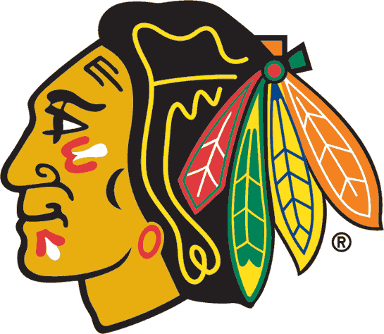
#3- Chicago Blackhawks Current Logo 1964-
There is no reason why everyone can recognize and love this logo. After winning two recent Stanley Cups in 2010 and 2013, there's a reason why this logo is practically commonplace currently with people like Patrick Kane, Jonathan Toews and Marian Hossa representing these colors every time they hit the ice. This logo, an indian with the typical face paint on, that an indian would have with four different colored feathers in the back makes this logo not just a historical and traditional logo, this logo can also be like a piece of art.
#4- Hartford Whalers Logo 1992-1997
People love this logo so much that they would love to see a hockey team move back to the Hartford, just to see these lovable colors back on the ice. These colors are still represented, even though this hockey team doesn't exist anymore by a bunch of people, even people outside of the State of Connecticut because everyone appreciates the history and nostalgia behind the logo with the whale fin with the H in disguise, which is made by the W on the bottom.
#5- Detroit Red Wings Current Logo 1948-
There is no reason why fans shouldn't like this logo. This logo above carries more history than most of the logos out there today. After eight Stanley Cups won while representing this logo with players like Gordie Howe, Dominik Hasek, Steve Yzerman and Nicklas Lidstrom, there is a reason why this logo is not just popular, it's also really famous and recognizable. It also represents the past of Detroit well with the automotive wheel in front with the wing in the back representing the people who used to assemble cars in Detroit, which gives the State of Michigan pride representing this logo of their proud past.
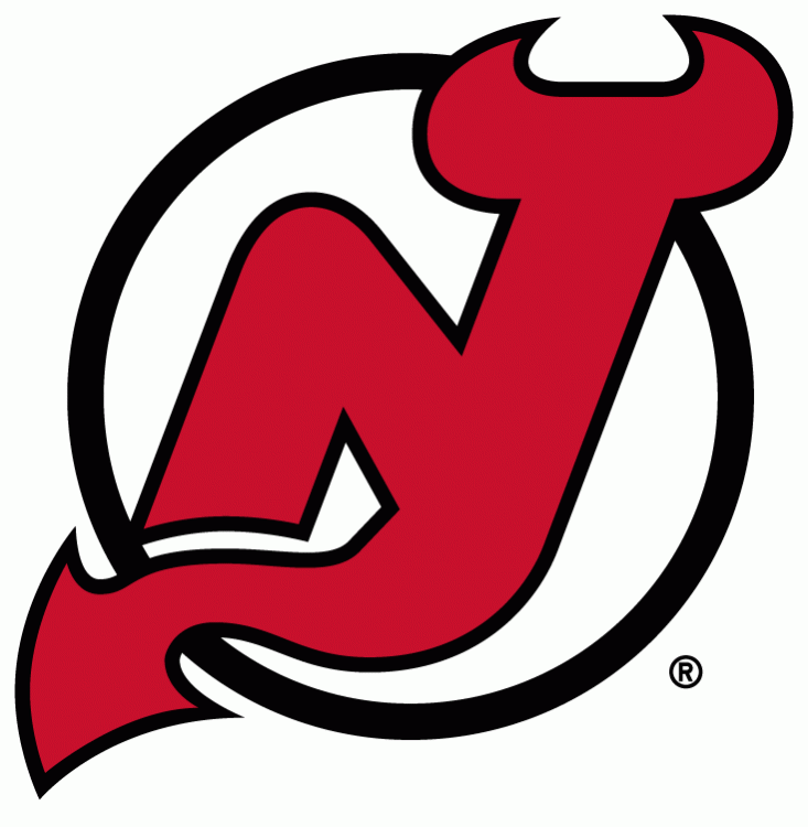
#6- New Jersey Devils Current Logo 1999-
This logo is popular among Devils fans because this logo represents the myth in New Jersey regarding the Jersey Devil that suposively walked around this state. Fans also get reminded of the days of when they won the Stanley Cup in 2000 and 2003 with players like Martin Brodeur, Scott Stevens, Patrik Elias and Jamie Langenbrunner. Fans like how this logo has an aggressive red and black with a New Jersey look with the angry yet sleek devil in the middle.
#7- San Jose Sharks Current Logo 2008-
How do you make the shark look more intimidating in the logo? Why don't you just make the shark look closer on the logo with the logo be more clear to make it ready for the next few years as being one of the NHL's best logos. From the chips of the wooden stick to the evilish yellowish-orange of the sharks eye, there's no doubt why fans love this logo and why it's so popular. This logo also has a California reference with the triangle representing the cities of San Francisco, Oakland and San Jose, the Bay Area, which is a breeding area for sharks, so there is no reason why this logo helped make Northern California become an area of huge hockey fanatics.